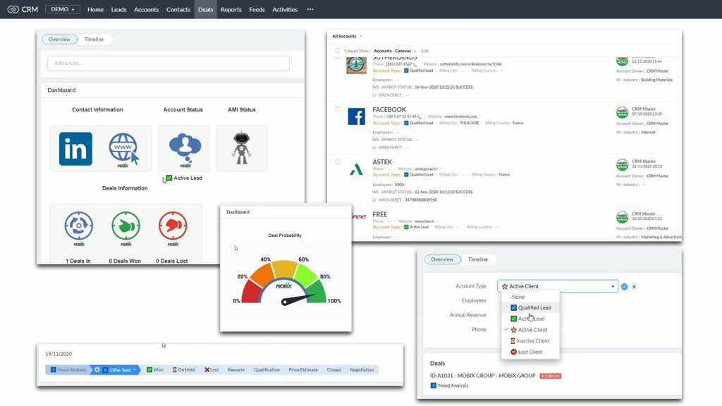
Brighten up your January with some colour in Zoho CRM

I was recently chatting to a friend who’s studying for an MA in Illustration and we got onto the subject of colours and branding. She’s learning how to brand her work to get noticed and it got me thinking. Where else can we use images and colour to get things noticed and eventually to get things done more efficiently.
Apparently, some of our brains are more visual than others. There’s a raging argument on the web about it so I won’t bore you with the details. The burning questions are:
Do you have a more visual brain? What does that mean and does it even matter?
With Zoho CRM the answer is simple, if it suits you and your team to make it more visual, go ahead. Here at MOBIX, we’ve been working in this way for a while and we’d love to pass a little bit of our colour on to you.
The three main modules we’re working with here are Leads, Accounts and Deals:
I hope that this visual representation has been useful in explaining what I mean. If you’d like to find out more about how this can be implemented in your environment, let us know!
